
Creating a sacred space to pause, reflect and connect with other women all while strengthen your relationship with Christ.
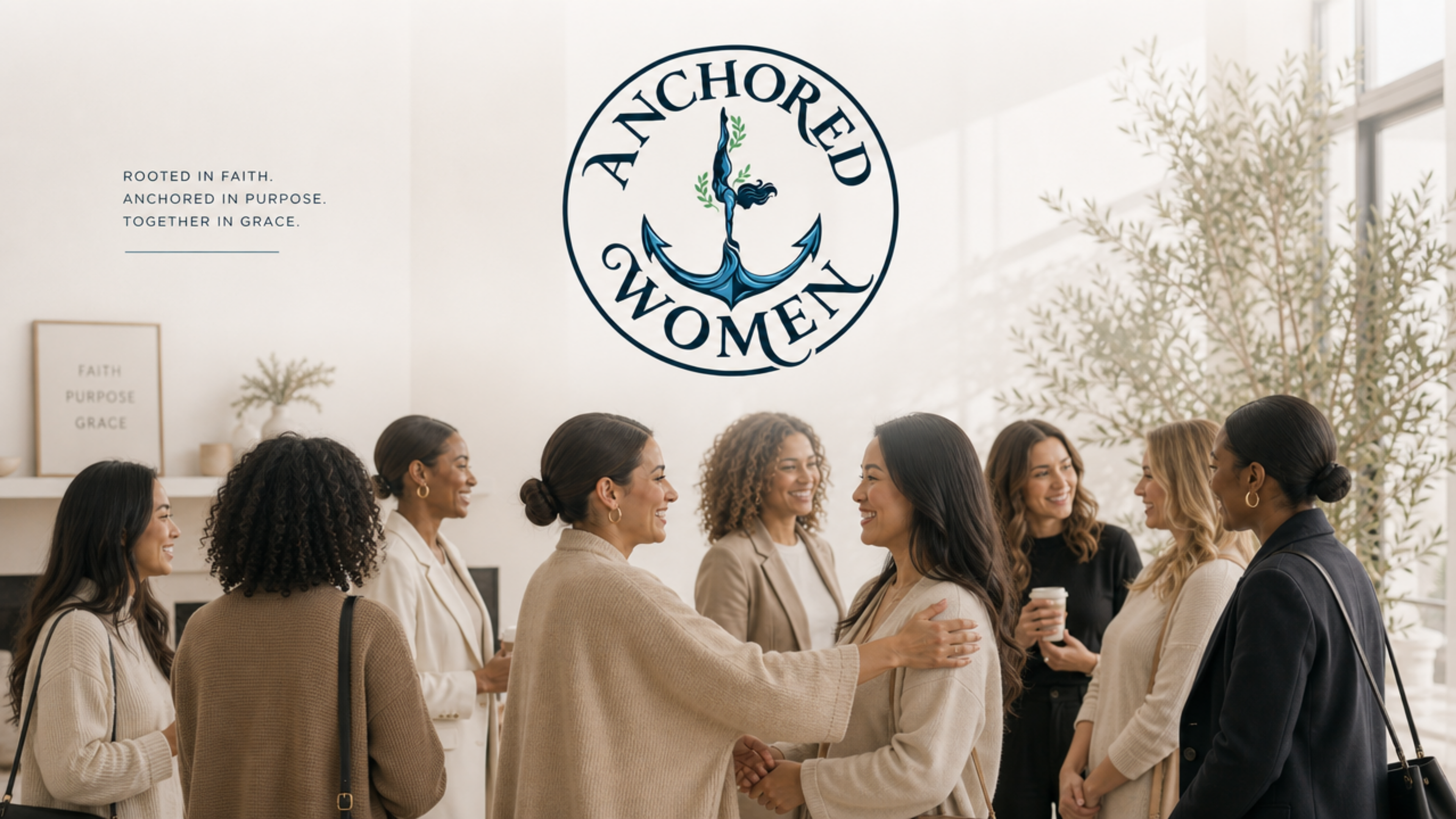
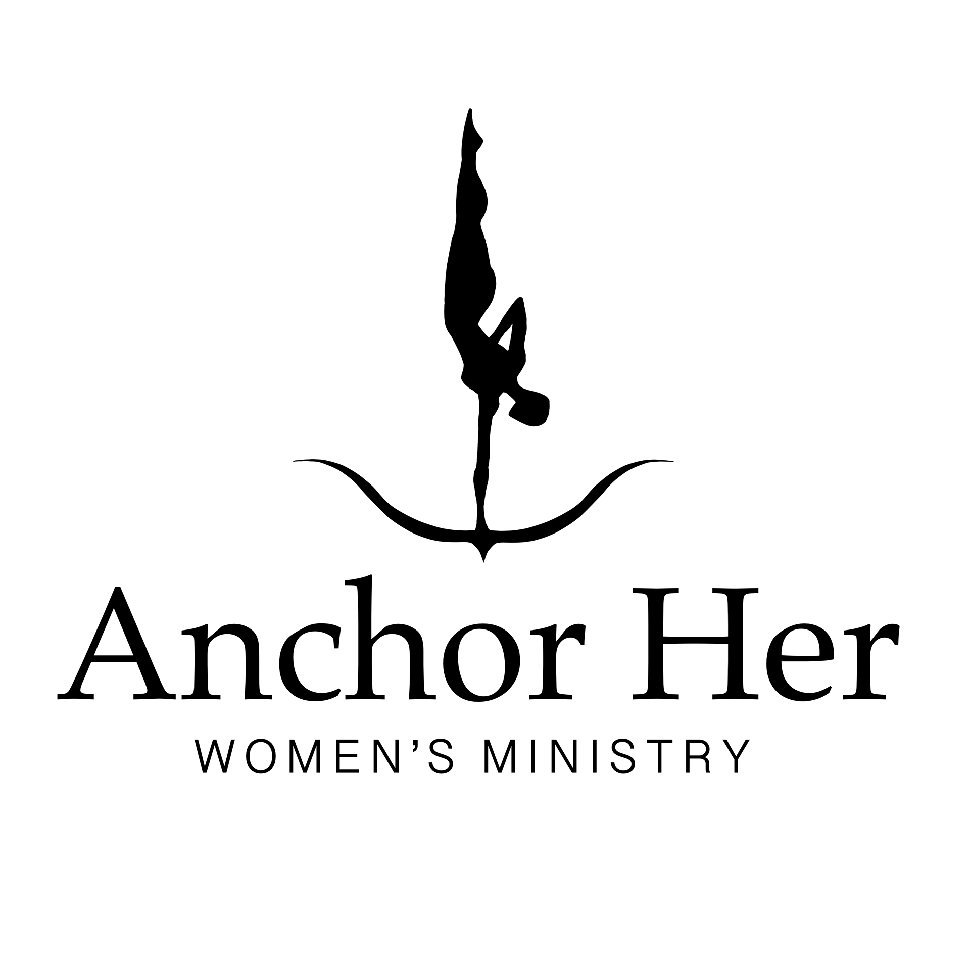
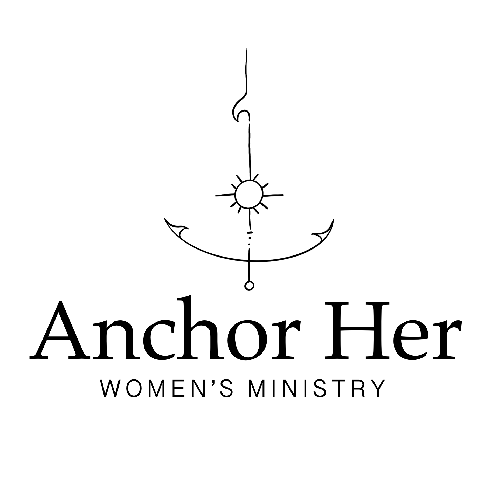
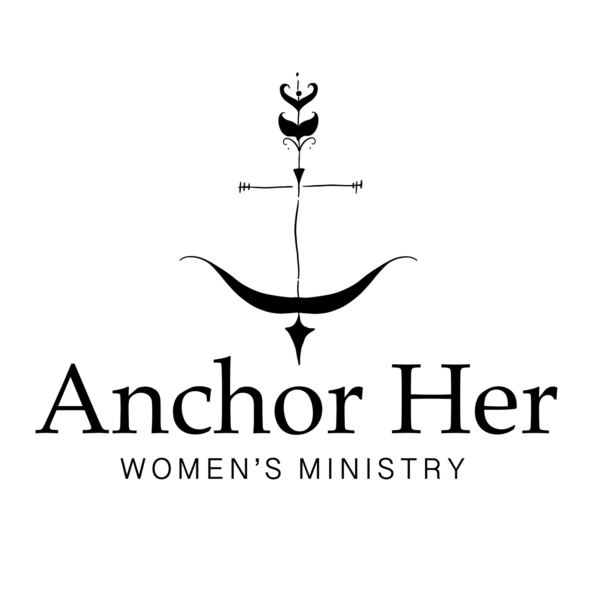
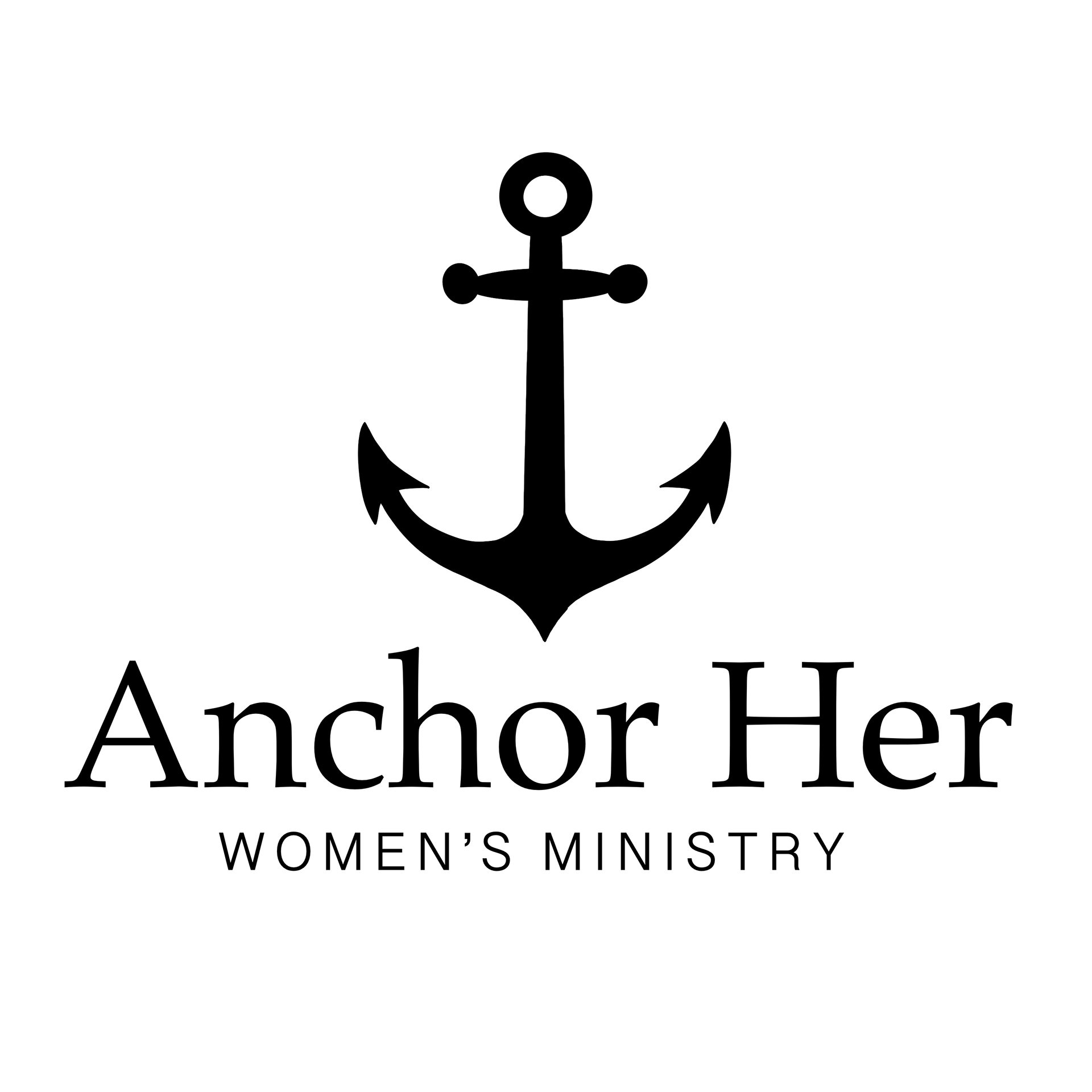
The images above are the initial concepts of Anchored Women, an anchor was to be the core symbol of the logo.


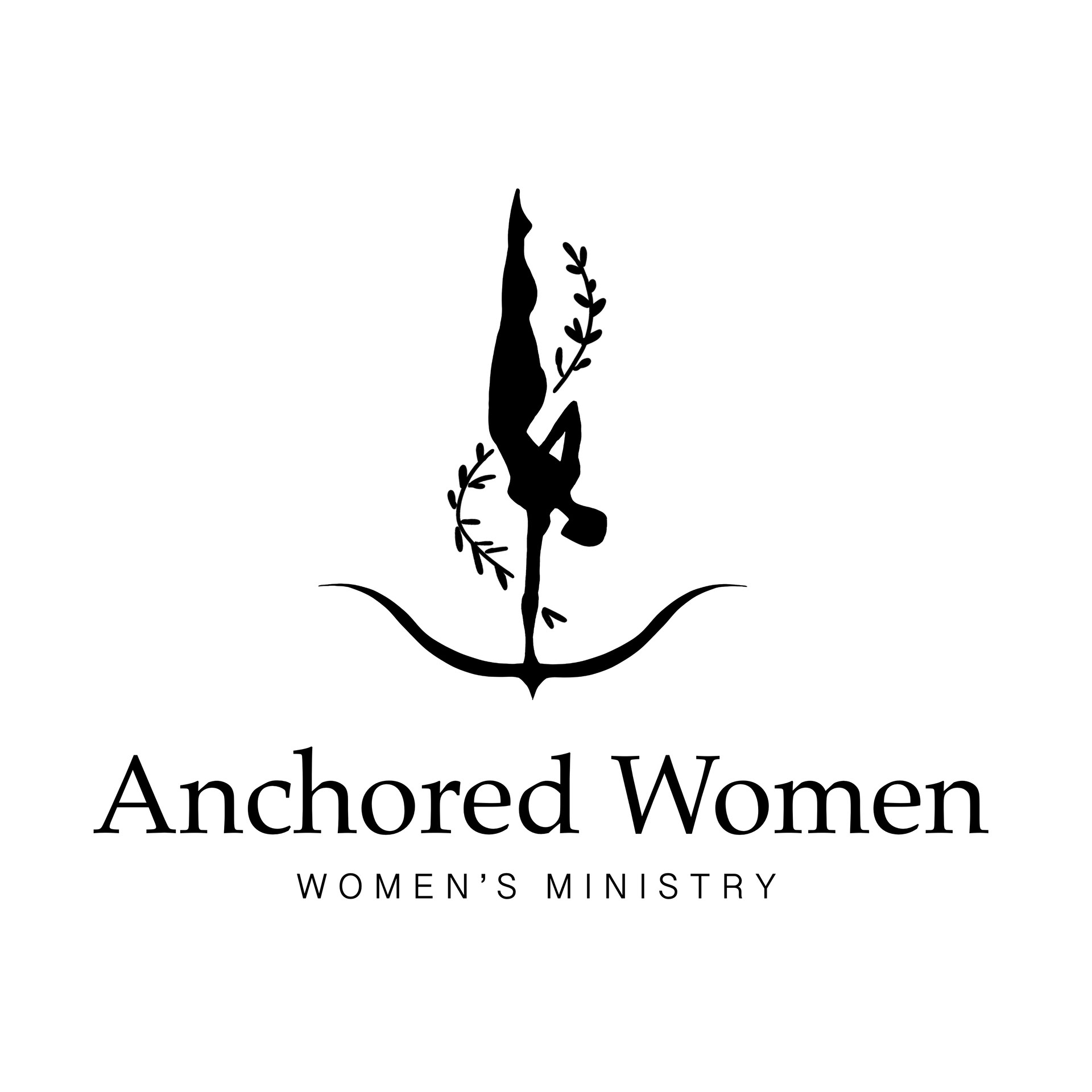
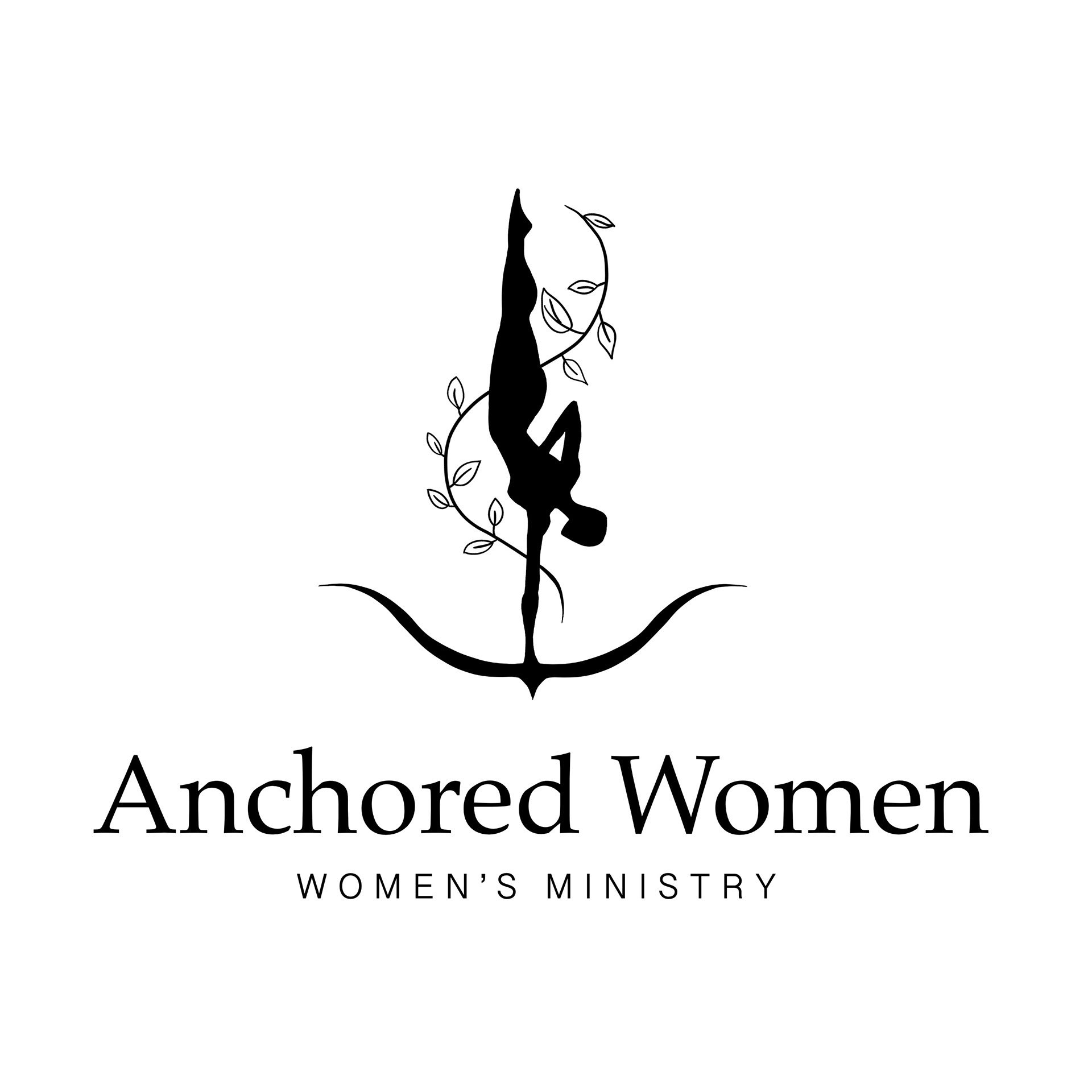
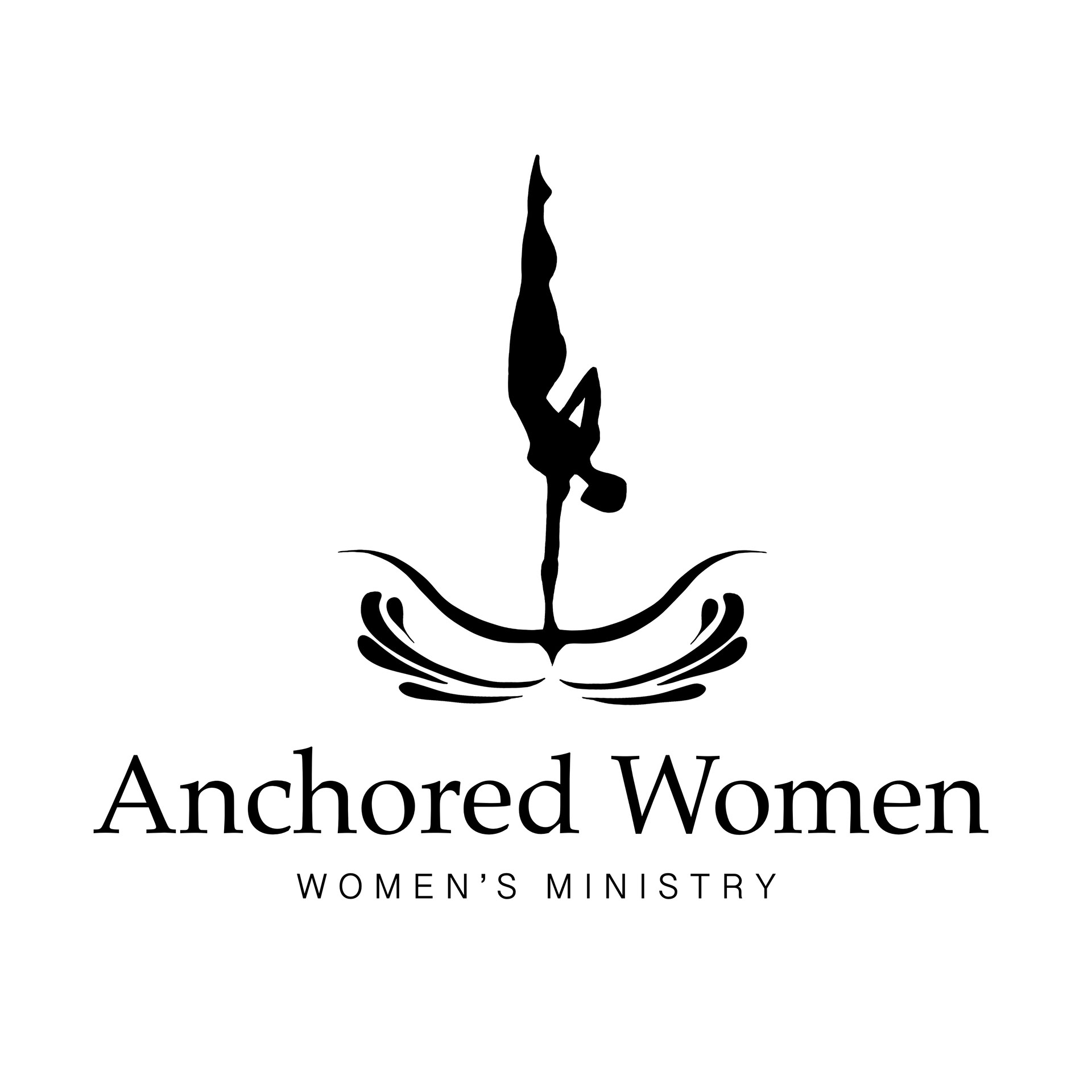
A less literal form of an anchor was chosen and the name of the ministry group was changed as well.
The logo premise became more concrete; it should feel elegant and feminine with clean lines for a modern-minimalistic aesthetic. The client went for a combination mark, using type and visual illustration. A color pallet of reds, blues and green were chosen to portray natural elements and type was to be serif for a strong, timeless feel.
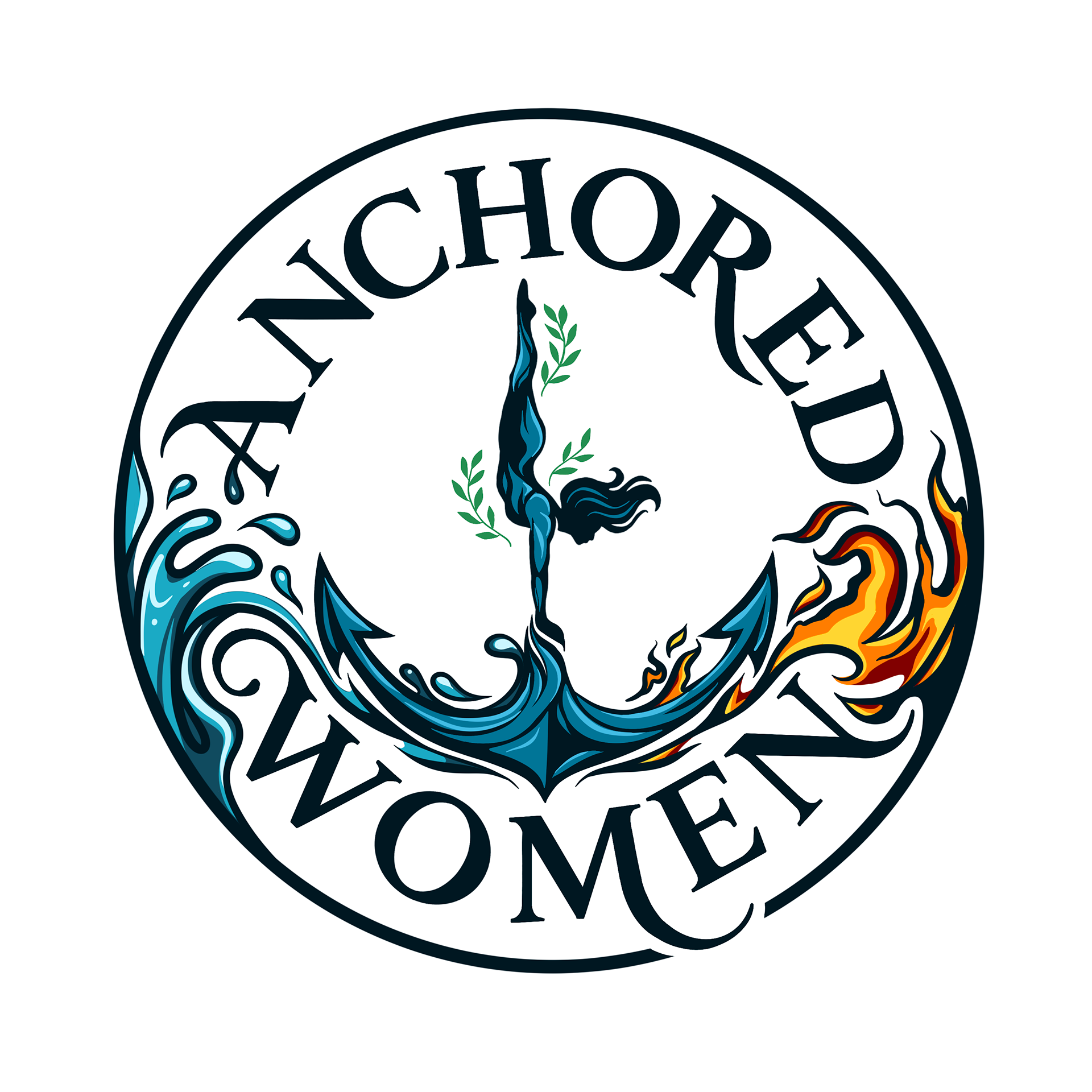
Initial advanced concepts were significantly altered; for the final logo the client desired a more detailed feminine figure and more stylistic typography. Each logo is to have separate uses which explains the inclusion and exclusion of visual elements for certain logos.